Showing posts with label spring. Show all posts

Fresh Fun Rainbow Nail Art for Spring!

Rainbow Nails for Spring!
 Spring is here and we've taken some inspiration from the copious of mini eggs we've consumed (as pictured above). We used 8 different colours with a pastel and bright shade of each to create this fun look!

A close up of our Rainbow Nails for Spring!

NOTD: Matte Pastel Florals for Spring

Matte Spring Floral Nails with Deborah Lippmann 'Glitter in the Air' as the base
As Spring (slowly!) begins, today's NOTD are these spring florals using Deborah Lippmann 'Glitter in the Air' as the base - a fabulously minty glitter that is the perfect backdrop for these beauties!

Happy polishing!

TUTORIAL: Faded Spring Floral Yin-Yang Nail Art

Matte Faded Floral Yin-Yang Nail Art


Get the look - polishes used include:

China Glaze White on White
(Dark to Light)
Pinks - Essie Bottle Service, Essie Boom Boom Room, Revlon Pink Pineapple
Blues - Essie In The Cab-ana, China Glaze For Audrey, Essie Mint Candy Apple
Purples - O.P.I. Push and Pur-pull, Essie Play Date, Essie Under Where
Greens - China Glaze Starboard, Essie The More the Merrier, Essie Navigate Her
Ciaté Speed Coat Pro
Essie Waltz
Nicole by O.P.I. Matte Top Coat

What do you think of this look? Let us know in the comments if you try it out!

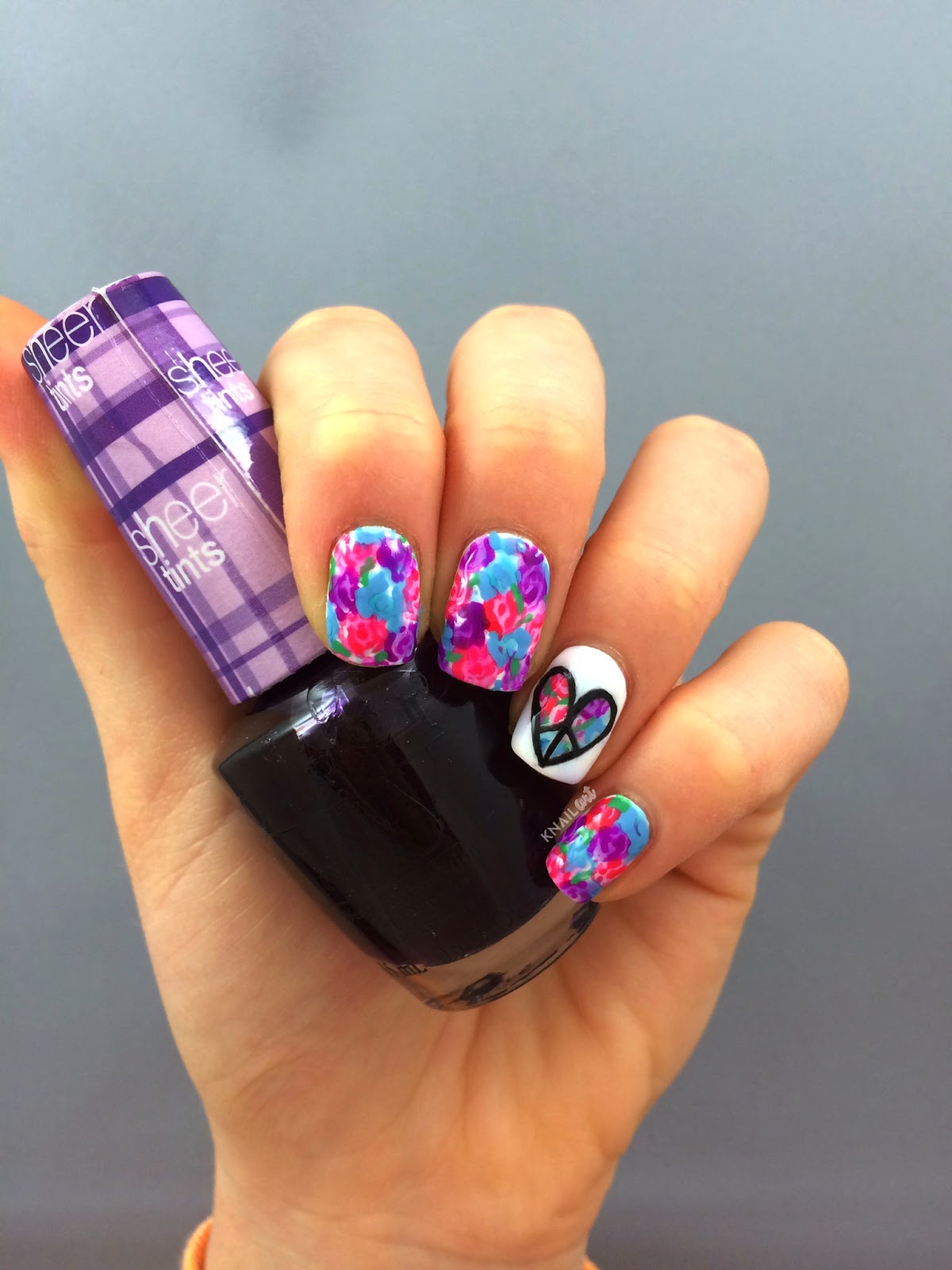
NOTD: Floral Peace Heart Nails (Motavator Logo!)

Floral nails ft. Peace Heart accent nail!
For today's nails we are in full spring spirit with some easy florals and a peace heart on the accent nail (this is also the Motavator sign - a logo used by youtube guru Bethany Mota)!

Our white base is our go-to China Glaze White on White. We used O.P.I. Sheer Tints in Be Magentale with Me, I Can Teal You Like Me, and Don't Violet Me Down for the base of the flowers. Then we outlined the flowers with Revlon Ginger Melon, Revlon Tropical Rain, and O.P.I. Push and Pur-Pull. We used Revlon Lime Basil for some random leaves!

For the accent nail - we followed the same steps as above, but finished off the look with a white heart outline, and then used a detail brush to drawl the symbol on in Zoya Raven!

We sped up the accent nail for a quick tutorial video which we posted on our instagram and embedded below... Happy polishing - and if you try out this look be sure to tag #knailart so we can check it out!


NOTD: Spring Pastel Rainbow Tie-Dye!

Pastel Tie Dye Nails by knailart (Pictured: China Glaze At Vase Value)

We're back at it! A spring-time pastel tie dye is our obsession of the moment - and they may be pastel, but in the sun they look super vibrant! We used mostly China Glaze pastels from the City Flourish collection, including the pictured At Vase Value. If you would like to know more about how to achieve the tye-die look... check out our neon rainbow tie dye post here! Happy Spring!

Pastel Tie Dye Nails by knailart

Top Three: O.P.I. Spotlight on Glitter Collection

O.P.I. Desperately Seeking Sequins (left), I Reached My Gold (back), and Rose of Light (front)
O.P.I. recently re-released some of their favourite glitters in a collection called 'Spotlight on Glitter' - we paired our favourite three with some of the Quo by ORLY Spring 2014 shades to show them off to you! We picked out a silver, gold, and rose gold  - the three new staple metallics, in our opinion.


First up is Desperately Seeking Sequins, a silver holographic glitter with tiny bar glitter, tiny holographic glitter, and some small hex glitters. We love anything holographic, so this is naturally right up our alley. Index and middle fingers have two coats, while the ring and pinky fingers have only one. This has great coverage and the formulation is perfect! This polish is definitely one of our recommendations if this is your thing.

O.P.I Desperately Seeking Sequins over Quo by ORLY Coral Contour

Next up is our least favourite of the three, I Reached My Gold, with large gold hex glitters and smaller silver holographic glitters of two sizes. This polish would be great, except that the hexes do curl a bit, which can make topcoat a difficulty. As you may be able to see on our middle finger, there was a bit of drag of the base polish - although it probably wasn't fully dry. The base on this polish is a little thicker, and could become gloopy if you work with the bottle open for an extended amount of time. There is one coat on all the nails with the exception of the middle nail, which has two.


O.P.I. I Reached My Gold over Quo by ORLY Sweet Blush

Finally, we have another of our favourites (who isn't obsessed with rose gold?) - Rose of Light. Our swatch shows one coat on the index, middle, and pinky fingers, and two on the accent nail (or ring finger). We love this. The small holographic squares and rose gold glitters make this a beautiful topper for almost any polish - for example, we don't love this base on it's own... but with Rose of Light as a top coat it totally works. A recommendation for any rose gold, glitter, or holographic lovers!

O.P.I. Rose of Light over Quo by ORLY Harmony

Overall, we were surprisingly satisfied by this rebrand of O.P.I's favourite glitters - let us know if you're loving these too and if you've tried any we would love to hear your thoughts!


Disclaimer: Some or all of the products mentioned in this post were provided by the company/PR in exchange for our honest review and consideration. All opinions are our own.

Swatched: Revlon Parfumerie Spring 2014 Collection

We are super excited to share with you the Spring 2014 Parfumerie releases from Revlon! This line is scented, so each polish has a distinct smell (as opposed to the regular polish-y smell) when worn without a topcoat... and they also last! We got our hands on a few of the Fall releases, but we are definitely more excited about these as the mix of fresh and floral scents is right up our alley. All swatches are two coats with no topcoat.

First up is Ginger Melon, a classic bright pink creme with an amazing fruity scent. We're terrible at describing scents, but found that all of these fit their name's pretty well - so we suggest you imagine or go test them out for yourselves! This polish is a pretty classic colour in any collection, but if you're looking for a fun, scented alternative - this is your best bet!

Revlon Parfumerie Ginger Melon

Next up is Apricot Nectar, a bright punchy coral. This polish is both jelly and creamy (a hybrid, if you will) and looks great in two coats. We love this, and it actually is a pretty unique colour, almost a neon peachy coral.


Revlon Parfumerie Apricot Nectar

Next up is Lavender Soap, a shimmery lilac. We don't love the application of this, and we also don't really love a soapy scent. This was a bit patchy (as you can see...) but did reach almost opacity in two coats. Not our favourite, but theres always one in any collection that just doesn't do it for you.


Revlon Parfumerie Lavender Soap

Next up is Lime Basil, and while we didn't expect to love this colour - we actually all really liked it! This is a green creme polish that applies well, and didn't stain at all (our swatch looks patchy on the outside edge of the ring finger, but its a reflection!).  This is a unique colour in our collection, and will definitely get used in some nail art in the future - a definite recommendation if you're looking for a unique but fresh spring green.


Revlon Parfumerie Lime Basil

Orange Blossom is a bright orange creme-jelly hybrid that is glossy and applies super smooth! This is two coats and we have to say that we are pretty impressed. This fills a large gap in our collection and we are loving it. Definitely a recommendation - this shade is like a juicy orange for your nails. Who wouldn't want that?


Revlon Parfumerie Orange Blossom

Next up is Pink Pineapple - this is another polish with a spot on scent! This is a great colour (reminds us of Butter London's Teddy Girl, but slightly more jelly) and it is actually a great formula somewhere between a cream and a jelly. We love this polish colour, and would wear it all summer long - an instatan shade!


Revlon Parfumerie Pink Pineapple

Next up is Sunlit Grass, a bright bold yellow creme that represents a colour that is often overlooked by polish makers, in our opinion. This really brightened up our skin tone, and we would definitely wear it. The scent is not super grassy, and smells pleasant (to us!) - this applied nicely and had good coverage and opacity for such a bright colour in only two coats!


Revlon Parfumerie Sunlit Grass

We literally saved the best for last. The scent of Tropical Rain is actually tropical rain. It's indescribable, but so amazing. You definitely need this colour - application was a breeze (a tropical one). And the scent is super amazing. If you only buy one polish from this collection, go buy this.

Revlon Parfumerie Tropical Rain
Overall, we absolutely love this collection. Our only grievance is that the lid is a bit difficult to hold... so be wary that it may slip through your fingers and keep a tight grip. Other than that, a great release from Revlon. Let us know if you are picking any of these up - and if you already have, let us know how you like them!

Disclaimer: Some or all of the products mentioned in this post were provided by the company/PR in exchange for our honest review and consideration. All opinions are our own.

Swatched: Quo by ORLY Spring 2014 Collection

Sweet Blush, Coral Contour, and Harmony from the Quo by ORLY Spring 2014 Collection

As Canadians, we routinely stalk our local Shoppers Drug Mart when new polish lines are released. As ORLY can be somewhat hard to find here - we are lucky to have the Quo by ORLY range available through Shoppers which mimics the ORLY trend shade collections. This spring, the release includes a range of blush hues. We have swatches of three of the polishes for your viewing pleasure! The quality of Quo by ORLY does not disappoint, and as long-time ORLY Glowstick fans (everyone needs this neon beauty), we feel that these polishes are on point with our expectations of the ORLY brand! All swatches are two coats without topcoat.

First up, Sweet Blush,  is a creamy beige nude with a hint of pink - we are loving this colour! This is definitely our favourite in the collection, because it is so wearable from day to night. This would be the perfect colour to wear on vacation.

Quo by ORLY Sweet Blush
Anyone who stalks our instagram knows that we are big fans of the brights. Coral Contour is definitely a bright, cheery pink and it would be a perfect polish for a night out, or a summer toe colour. This would also look great with a white base coat underneath to really make the colour pop!


Quo by ORLY Coral Contour

Finally, this is Harmony, a deep mauve which doesn't quite gel with our skin tone. We do like this polish and the application is great, but it isn't one we would run out to get. If this colour speaks to you and you don't have anything like it in your collection - go for it!

Quo by ORLY Harmony

Overall, we are impressed with the consistent quality of this line, and will definitely be shopping for some more Quo by ORLY polishes in the future - who can say no to an extra polish during a Shoppers run?


Disclaimer: Some or all of the products mentioned in this post were provided by the company/PR in exchange for our honest review and consideration. All opinions are our own.

Swatched: Ceramic Glaze Crushed Foil (Cosmic Enchantment Collection)

Any Canadian readers will know that Shoppers Drug Mart carries its own range of some polish brand favourites - such as Quo by ORLY and Ceramic Glaze. We have some swatches of the Ceramic Glaze Cosmic Enchantment collection here today (the Crushed Foil polishes) - and while we had mixed reviews based on other swatches of foil type polishes we've seen, we actually really love this look! It is super unique and really looks and wears well! All of these swatches are two coats and applied surprisingly easily! We definitely recommend all of these if you are in to the textured look. We would pair it with a feminine top or dress to complete the look. On to the swatches...

Ceramic Glaze Celestial Romance (Crushed Foil)

Ceramic Glaze Quantum Love (Crushed Foil)

Ceramic Glaze Flirting With Astronauts (Crushed Foil)

Overall, we were pretty impressed with how well these polishes applied and we actually ended up loving the look despite our hesitations! We would definitely recommend picking one or two of these up if you end up in a Shoppers Drug Mart any time soon!

Disclaimer: Some or all of the products mentioned in this post were provided by the company/PR in exchange for our honest review and consideration. All opinions are our own.

Swatched: Nicole by OPI Rougles Collection

If you follow us on Instagram, you may have had a sneak peek at this collection! The Nicole by O.P.I. Rougles (think Ruffles chips) collection should be rolling in to stores now! This collection mixes pastel and texture perfectly, and the shades are reminiscent of a tweedy pastel blazer - we love it. The swatches are two coats with no top coat - we had no problem with opacity or application with any of these polishes! We hate when a polish looks great in the bottle but applies like a mess, so we're happy to say that these apply similar to any other textured polish. As long as you use relatively thin layers and let your previous layer dry for a minute between coats, you shouldn't have any problems.

First up is I'm Stucco on You - this is a pastel purple with blue and a few orange speckles floating around. We absolutely love this colour because it is so unique. We tend to hoard blues, but this purple is definitely one of the stars of this collection.
Nicole by O.P.I. I'm Stucco on You

Next is Rock the Look, a pastel-y pink with a hint of brightness and brighter pink and orange speckles. This colour isn't as standout as the rest for us, but if you love pink texture... this is for you!

Nicole by O.P.I. Rock the Look
On What Grounds? is definitely a polish after our hearts. We are typically mint-obsessed and On What Grounds? has us tempted to do a Monster's Inc. nail art (Sully, anyone?). This is a pastel turquoise blue with some slightly deeper blue speckles. This is another must-have from this collection!
Nicole by O.P.I. On What Grounds?
Finally, Sand in My Shoe is a pastel yellow with pink and orange speckles. This screams baby chick to us, but since we're approaching Easter it totally works! This would be great for a chicken nail art. If your collection lacks yellows (ours can always use another yellow or green shade!), this is definitely a good addition!
Nicole by O.P.I. Sand in My Shoe

What do you think of this collection, and will you be picking any shades up?


Swatched: Essie Hide and Go Chic Spring Collection 2014

Today, as I type this in a snow squall, we have swatches of the new spring collection from Essie - Hide and Go Chic. This collection features 6 creamy shades with a focus on pastel blues and pinks. We actually didn't hate a single polish in this collection, but we are particularly enamoured with a few. So, here we go!

First up is Fashion Playground, a pastel green described accurately by Essie as 'pistachio'. This has the tiniest bit of shimmer, but if you're anti-shimmer it shouldn't bother you like past Essie shimmers have with larger silver glitter pieces. This swatch is two coats, and as you can see this polish has great opacity!


Next up is the headline polish of the collection, Hide and Go Chic. For some reason, we find this blue reminiscent of a greek vacation. This is a creme shade, and this swatch is two coats. Although this colour is unique in our collection, we love how original Fashion Playground is comparably. However, if you're missing a medium blue in your collection and feel like you need to fill that void, this is a great option.


This baby pink beauty is Romper Room, and it is literally the perfect pastel pink. We have a butter London pastel pink which was previously our go to - and it has been replaced. The formula on this is literally impeccable and we would recommend this to anyone, even if you already have a pastel pink in your collection. This will definitely get lots of wear this spring!


Next up is a nude marketed as 'semi-sheer' by Essie - Spin the Bottle. In three coats (in the swatch below), you get to opacity. Even with two coats however, it still has pretty good coverage for those who want to keep their nail lines private. We thought this worked well with our skin tone, but also think it would work well with a darker skin tone (however, lighter may be a no-go).


Next up is the bright of the collection - Style Hunter. This is a super bright 'crimson' (Essie's words) and the description of 'laser sharp' seems to be right on. This is definitely a statement polish, but we can see it working with spring florals really well! This is two coats, and application was flawless.


Lastly we have Truth or Flare, a 'vintage blue denim' - while we agree this polish has a vintage look to it, we wouldn't say denim. This polish fits well with the collection, but as you can see on the left edge of the pointer finger, coverage can be patchy if you haven't perfected flawless application. This is the one polish we would say to skip in this collection, but that said - in two coats, it does have a really nice shade that matches well with Hide and Go Chic for a potential two-tone mani.


Overall, we're really impressed with this collection from Essie and definitely recommend picking up a few shades. Let us know what you think!

Disclaimer: Some or all of the products mentioned in this post may have been provided by the company/PR for our honest consideration and review.

Swatched: KBShimmer Spring 2013 Collection

We were so excited to win a Facebook contest by Harlow and Co. of the whole KBShimmer Spring 2013 Collection. This post is long overdue, we've been playing with these shades for awhile (Get Clover It was the ultimate St. Paddy's Day shade!) and we have to say that the whole collection is a winner! So, lets get to it!

First up, is our St. Paddy's favourite, Get Clover It. This is a deep green jelly with micro green shimmer and green, gold, and blue-green circle glitter (we're obsessed with circle glitter right now!). This swatch is three thin coats with no topcoat. It is still slightly see through, but the coverage is definitely good and there is lots of glitter to go around.


Next is I Got A Crush on Blue. This is a mix of multi sized silver/holographic glitter in a blue jelly. We love how the glitter sparkles in this, although it was difficult to catch on camera. In the bottle you can see how this shines in real life! This swatch is also three thin coats with no topcoat. The larger glitter in this polish was less abundant but the holographic shimmer was even throughout.


This polish, A Dot Mess, is meant as a glitter topcoat - however, we like to aim for a full glitter nail to see how the polish truly performs! This is a mix of pink and black medium glitter and fine glitter in a clear base. This is three coats, and we are super impressed with how great the glitter coverage is in this polish! It can be inconsistent (see the difference between the second and third fingers) but it is gorgeous and the pink glitters are the ultimate shade of fuchsia.


This polish, Iris My Case, is a purple and blue small to fine glitter polish in a lavender creme base. This is three coats, and it definitely reached full coverage. We love how this looks and will definitely be matching this with a lavender jean come warmer weather. This polish could pull for our favourite of the collection.


This polish is called Lottie Dottie and is a mix of bright blue and fuchsia glitter in a soft white creme base. We aren't bothered by this polish, but wouldn't wear it on its own. It applies well and we are impressed at the coverage with three thin coats.


This polish is called Spring Training, and although the polish is supposed to have a soft green creme base, it really is closer to white on the nail. We love how the glitter comes through as more layers are applied, and actually we like the colour palette of this polish much more than Lottie Dottie. We were hoping this polish would be on the verge of mint (our obsession) but we actually like how pale it is. This swatch is three thin coats with no top coat.


This next polish is also marketed as a top coat, and is called Pastel Me More. It is a mix of many pastel glitters in many sizes. Basically its a pastel glitter bomb. While we wish there were more pinky/purple pastels in this, we love how great the coverage is with three thin coats and would definitely layer this over some other polishes for a great glitter accent nail!


This next polish is the final 'top coat' of the collection (and our favourite of the three!), called Squared Away. It contains multi-sized square glitters in a variety of colours. Most noticeably, pink blue and a silver holographic. There are also micro glitters which are pretty visible on the nail. The coverage on this can be spotty but we will definitely be rocking this over black! This swatch is three coats with no topcoat.


If you've never eaten a peep near Easter time, you are truly missing out. This is Where My Peeps At, a creme yellow base with multicoloured circle and hex glitter. This shade is super fun and we can totally see it transitioning in to summer (with a yellow polka dot bikini? match made in nail polish heaven)! This swatch is three thin coats with no topcoat. It may be beneficial to wear this shade with a yellow undie, as if you look closely you can slightly see the nail line on some nails.


Overall we love how this collection turned out (glitteraholics? yes.) and we're incorporating this shades into many a manicure as spring comes full on! If you had to pick one from the collection, we suggest Spring Training. And if you had to pick two (had to…) we would go for Squared Away. What do you think of this collection?

OPI Euro Centrale Nail Art

This OPI Euro Centrale inspired mani contains 4 OPI Euro Centrale shades, including: 
  • A periwinkle for the base colour, in You're Such a Budapest
  • A deep blue-purple, for the triangle colour (and line details) in Eurso Euro
  • The glitter, in Polka.com
  • A turquoise for the circle within each triangle, in Can't Find My Czechbook
We also used striping tape and a nail art brush to place the glitter and draw fine lines for this look!


For this look, we started with the two coats of the base shade, a purple based periwinkle colour. We were really loving the blue tones in this collection, which is how this mani came about! We then placed striping tape where the outline of our triangle pattern would be. Using the deep blue-purple and a nail art brush we lined the inside of each triangle. Then, we used the nail art brush to place the glitter within this boundary in a rough triangle. Note: this look can be simplified by filling the whole triangle with glitter instead of tediously placing the glitter! Then we used the nail art brush to paint the centre of each triangle with a turquoise shade, and then filled the open space with some more pink glitter and fine details.

We love how this turned out! Glitter placement is definitely a time-consuming task, but we think it's worth it. What do you think?

Swatched: OPI Euro Centrale Collection

We're excited to share with you swatches of the OPI Euro Centrale Collection! This collection has a mix of rich cremes, with a few metallics thrown in! We swatched 6 shades from this collection and are in love with the colour payoff! 

This is You're Such a Budapest, which is a periwinkle (although it photographed slightly more purple!) with a hint of shimmer. This is two coats without topcoat - one of our favourites!


This is our favourite shade from this collection - Eurso Euro. This royal blue has deep purple undertones and really packs a punch in terms of colour payoff. Two coats with no topcoat.


This is Can't Find My Czechbook, is a blue turquoise which continues the great colour payoff trend in this collect. Two coats without topcoat in the swatch below.


This shade is bright - almost blinding red-orange. You cannot miss My Paprika is Hotter Than Yours from a mile away. We loved how this looked and will definitely be adding this to our rotation! Two coats to opacity, no topcoat.


This shade turned out to be more of a jelly than the others when we applied thin enough layers - perhaps a jelly sandwich in our future? Suzi's Hungary Again is a cheery pink, we applied three layers with no topcoat for this swatch.


If we're one thing (other than nail polish addicts) it would be glitter addicts. This glitter is fab! Pink, turquoise and blue-purple small hex glitters mixed with fine glitters in the same colours make a great topper for any mani. We used two coats of Polka.com over Eurso Euro for this swatch.


Overall, we love how fun and bright this collection was. The collection includes a total of 12 polishes, which in addition to the ones above boast copper, rose, and gold metallic shades, as well as a milky creme (My Vampire is Buff) which we're currently on the hunt for. The collection also includes another, darker blue shade in I saw… U saw… We saw... Warsaw as well as a deep purple shade in Vant To Bite My Neck? We definitely recommend checking out the rich hues in this collection - and stay on the lookout for our nail art using some polishes from this collection in the coming days!

You can check out OPI online, or on Facebook, Twitter and Instagram!

Disclaimer: These products were provided to us by the company/PR for our honest consideration and review.