Showing posts with label 2013. Show all posts

Swatched: Essie Encrusted Treasures Collection

Today we have some swatches of the Essie Encrusted Treasures collection. This collection claimed to be a game changer in textured polishes, and while I feel that some of the polishes can't be beat, there are definitely a couple that definitely missed the mark. As Essie-lovers, we are sad to say that this collection didn't live up to our expectations as a whole - however, we have still been using the better formulated polishes on the regular and loving them.

We are missing one swatch from today's line up - Peak of Chic - which is a holographic silver and white bar glitter (in a clear base). This polish applied well, and is similar in finish to the feathers collection by Nails Inc. On to the swatches...

Our first disappointment is the headline shade for the collection, and one of the polishes we were most excited about - Belugaria. This polish is marketed as highly textured - and that it is! However, the thick sandy texture causes highly clumped polish in the bottle which just doesn't translate on the nail. The one saving grace, the holographic glitter, is sadly not quite visible through the thick polish. This is two coats with no topcoat, and as you can see it is quite bumpy. While we are all for the textured polishes, this one just missed the mark. The finish is definitely caviar, and we have used on our nails, however we wish that there was a little less texture, and a little more glitter.
Next up we have a potential favourite, Hors D'Oeuvres is a silver glitter in a gold shimmered clear base. This has super incredible coverage and is literally an obsession of ours. This polish would be perfect for a glitter gradient or accent  nail, and we definitely recommend picking it up.
This charcoal-silver matte glitter is another hit from this collection. Ignite the Night is gorgeous on and would also be a great accent nail. This polish applies well and has great sparkle.  We love this for spring mixed with pastels. Stay tuned for some nail art featuring this shade! This polish is not quite textured, but does dry matte and maintain its shimmery goodness, which is a super cool finish.

Another one of the better polishes from this collection is the sparkly blue jean textured polish named Lots of Lux. This polish is not aggressively textured like Belugaria, but has a slight texture and a gorgeous sparkly finish. We love how this looks on the nails and it will definitely get some wear on all of our nails!
Finally we have the most unusual polish of the bunch. Essie is generally not a risk taker with glitters such as this, but the mix of blue glitter with a silvery gold shimmer base is a fun twist on the norm. This polish applies well, and we may try it out in a glitter gradient over a lighter blue to see how it fares. If this type of polish is your thing, we say go for it - but if you're a little less daring, stick with Hors D'Oeuvres for your silver and gold glitter needs.


What do you think of this collection? Have you tried any of these polishes and had a different experience? 

Disclaimer: These products were provided to us by the company/PR for our honest consideration and review

Swatched: Essie Winter Collection 2013


This years Essie Winter collection - named Shearling Darling - was on point with some great deep creme shades (which we're in love with) as well as some great pastels and a browny shimmer. The collection also features a red glitter shade which screams holiday to us, however wouldn't fit in with the Encrusted Treasures collection released for holiday time! Some of the photos have been faded to ensure the photo matches the true colour!


First up is 'Toggle to the Top' a rich red packed with sparkle. This is the perfect polish addition to a holiday ensemble and applies smoothly. 


Next up is what Essie calls an ebony red - 'Sherling Darling'. While we love how deep and rich the colour is, it is a super-stainer (note the cuticles...). Make sure you use a base coat with this polish!


This polish looks like a pastel-y purple, but it is actually quite a rich colour. This creamy pink-purple, called 'Warm & Toasty Turtleneck' is absolutely beautiful on the nails! This is definitely one of our favourites from this collection.


Next up is this rich brown cocoa - 'Sable Collar' has a hint of purple and shimmers beautifully. This polish is absolutely gorgeous and will definitely be getting some winter wear!


This grey-teal is somehow muted and bright at the same time, and we're in love. With the tiniest hint of shimmer, 'Parka Perfect' applies beautifully and somehow works for winter as a 'pastel'.


The final polish from this collection is 'Mind Your Mittens' an ultra deep blue-green polish. We love how this looks on and it applies well - recommend!

Overall, we're loving how this collection looks, even though the glitzy red doesn't seem to fit. If we had to pick just one, we'd go with 'Parka Perfect'. Happy Polishing!


Disclaimer: These products were provided to us by the company/PR for our honest consideration and review.

Swatched: Revlon Haute Tropics Collection (Summer 2013)


Today we have some more fun summer swatches for you! The Revlon Haute Tropics Collection is limited edition and in stores now until the end of June. This collection is a mix of colours and finishes - it borderlines on cohesive as a collection, but shade by shade it definitely has a polish for everyone!


First up we have Belize, Please - this is a bright pink with a subtle shimmer - a classic summer polish. This polish applied super well (this swatch is three thin coats) and we're happy with the results. This is definitely something we would pick up for a pedicure colour!


Next up is Cabana Queen. This is a pearly white, and the swatch is three thin coats. You really need to wait between layers until the polish is fully dry to avoid balding - but this does build up to mostly opaque pretty well for a white shimmer! This would also look great over a true white polish for a twist on white nails which are currently trending...


This polish looks great in the bottle, but we have to say we were a bit disappointed with the sheerness. It is a jelly with a bit of shimmer, but we wish it built nicely to a full coverage colour (because it's so pretty!) This is Coast is Clear, a shimmery mint polish. This would look great with a layer of glitter in between two coats, called a jelly sandwich (are you hungry?)!


Next up is Hello, Bali which is a purpley-wine jelly. We love how this polish builds and the colour is perfect for a summer to fall transition shade (August is calling our name already!). This swatch is three thin coats and the colour is perfect - not to red and not too purple.


Next up is Lagoon Afternoon, a creme grey-blue polish which is true to its name - we're imagining a lagoon right now (or at least a beach!). This polish applied super well in two thin coats. You could probably get away with one slightly thicker coat, but we like the faster dry times that come with thin coats!


Next up is a mauve-y beige with pink shimmer, called Secluded Beach. This is the perfect colour if you want a laid back mani, but don't want to be too boring! If you're going on vacation and can only bring one polish to touch up your tips - go with this one! This is two thin coats and the coverage on this was great!


Next up is the brightest colour in the collection; if you've been following us, you know we're obsessed with brights right now. This is Mai Tai Ask? and it is an orange crelly (creme jelly), which means that it is fully opaque but still gives that plush jelly polish look! This is probably in competition with the next polish to be our pick of the collection!


Finally, we have Plunge Pool, a royal blue metallic polish which is absolutely gorgeous. Surprisingly, we have nothing like this in our collection and are totally obsessed. This is one of our favourites and applies perfectly in two coats.


Have you seen these out and about, and which of these polishes are you loving? Show us on Facebook, Twitter or Instragram - @knailart or #knailart

If you'd like to follow our blog, check us out on Bloglovin!


Disclaimer: These products were provided to us by the company/PR for our honest consideration and review.

Swatched: Essie Summer 2013 Nautical Collection

Fresh off the boat… Essie's Nautical themed Summer collection is ready to go - even if the weather hasn't quite got the memo yet. This collection is half bold brights and half soft shades, (almost) all with a sprinkle of glitter. The shimmer in these is a bit hard to catch with the proper shades, so we used different lighting between pictures to ensure our swatches are colour-accurate. 


First, we have Full Steam Ahead - a dusty lilac with silver shimmer. This polish is definitely a mix of creme and jelly. Three coats to opacity (and in this swatch) really give the shimmer depth, and we love the result.


Next up is our favourite from the collection (and it has the best name!) - Naughty Nautical. This is a teal polish with the same silver shimmer as the last. This swatch took two coats, and it applied beautifully. If you only pick up one from this collection - it should be this one.


Rock the Boat reminded us of a previous Essie summer hit, Bikini So Teeny, however this polish is actually a bit lighter. This one was the most difficult to capture, and to apply. With three coats we had opacity, however there were still some balder spots. Not super impressed with this formula - but we do love how well it pairs with Full Steam Ahead.


A perfect mix of brightness and shimmer lead to this coral masterpiece, Sunday Funday. This applied super easily with two thin coats required for opacity. This polish continues the shimmer-y theme and we love this bold polish paired with a pastel look.


Our second favourite of the collection is The Girls are Out - although the name is a bit awkward! This is a bright berry with the silver shimmer. This applied super well and with two coats looks perfect. We have been wearing this on our toes for the perfect summer pedi.


Last is the oddball of the collection, a chartruese (described by Essie as a lime green - it is not!) with no shimmer. This poor guy got left out when the nail polish people were dumping in the shimmer. It applies well and looks good with just two coats, but we wish it fit in a bit better with the rest of the collection.

Overall, we are loving the brights in this collection, but think its safe to leave the pastels! Have you seen this collection, and which have you picked up?

Disclaimer: These products were provided to us by the company/PR for our honest consideration and review.

Swatched: Essie Neon Collection

Essie released their 6 polish Neon Collection May 1st, and since then we have been going a bit neon crazy with these polishes! We are happy to finally have them swatched here so you can see how they look on the nails! With the exception of Boom Boom Room (first up in this post) these all go great if you're looking to do some neon rainbow-y type nail art. We used them and Orly's Glowstick to create a fab tie dye nail art tutorial, our first venture in to YouTube! Let the swatching begin!

First up is Boom Boom Room. Admittedly, this is not a true neon. The best way to describe this polish is a bubblegum pink. It is bright, but it is not neon. This polish is also a creme polish, unlike the rest of the collection. As neon lovers with high expectations, this did leave something to be desired. This swatch is two coats with topcoat.


Next up is Bouncer, It's Me! This polish is the perfect royal blue jelly, Essie has not strayed from their past blue masterpieces (Bikini So Teeny, Mint Candy Apple, Butler Please, etc.) - they have anything in this shade under control. The polish applied well, and dried without shine like most true neons. This swatch is three thin coats with topcoat.


This purple, DJ Play That Song, is the ultimate shade of violet (lighter than true purples, if you were wondering the difference!). This is the most opaque of the jellies, and this swatch is only 2 thin coats, with no visible nail line! This is probably our favourite polish in this collection.


This next shade is Saturday Night Fever, a coral-orange (or perhaps just an orange with a hint of red) neon jelly that is really too bright to handle. This swatch is two coats, and although you can still see a bit of my nail underneath (calcium spot on my ring finger!) - the colour is so intense that you wouldn't really notice.


The second last polish is a green, Shake Your $$ Maker. Great name aside, this polish is a bit too jelly sheer for our liking. This swatch is 3 think coats, and on some nails you can still see a visible nail line. Disappointing. Over white polish, this doesn't matter as much and it actually has a much more neon effect.


Finally, we have Bottle Service, a super-bright fuchsia. This polish is a jelly, and goes on great. The swatch below is just two coats and it is fully opaque - yet still has that 'squishy' jelly appearance. We love this!


What neons are you loving for Summer, or are you going for a totally different trend altogether? 

Check us out on Instagram to see a dupe for Bottle Service, and if you'd like to see more follow us on Bloglovin!

 Disclaimer: Some of these products were provided to us by the company/PR for our honest consideration and review.


Swatched: Rainbow Honey for Fab Summer Set

Rainbow Honey is a new to us indie brand best known for their shimmer and glitter polishes. We were happy to review their Summer collaboration with Fab.com which is now available for $25 (for the three full size/15mL lacquers). When we first saw pictures of the collection, we have to admit our minds went to Christmas (red, green… you can't blame us!) - however, when you see these polishes in person they really reflect the bright colours of a south american vacation. And now we're just dreaming. 

First up is Schrammi, described by Rainbow Honey as a deep coral with gold shimmer. We found this to be more of an orange-based red with gold shimmer, but you can see for yourselves! This swatch is two coats for full opacity. The polish went on smooth and the gold shimmer looks amazing when it catches the light. This is our favourite of the two shimmers in this collection.


Next up is Costa del Sol, which we've swatched over black, which is a golden holo glitter extravaganza. Bar, hex, and gold shimmer galore, this polish is definitely an eye-catcher. This swatch is one coat, and the glitter applied evenly and didn't create any unwanted texture (a major plus!).


Finally, we have Tenda, a true kelly green with gold shimmer. While we don't usually gravitate towards greens for summer, this is so bright and beautiful that it will get its wear in. This swatch is three thin coats, and like the rest of the polishes, applied super evenly and has great shimmer distribution.


Overall, we're loving the quality of these Rainbow Honey lacquers, and would definitely recommend them. If these colours are speaking to you (they may be asking you to go on vacation and bring them along!), you can check the set out on the Fab website. If you'd like to see more from Rainbow Honey, check them out on their website, Facebook and Instagram.

Swatched: KBShimmer Spring 2013 Collection

We were so excited to win a Facebook contest by Harlow and Co. of the whole KBShimmer Spring 2013 Collection. This post is long overdue, we've been playing with these shades for awhile (Get Clover It was the ultimate St. Paddy's Day shade!) and we have to say that the whole collection is a winner! So, lets get to it!

First up, is our St. Paddy's favourite, Get Clover It. This is a deep green jelly with micro green shimmer and green, gold, and blue-green circle glitter (we're obsessed with circle glitter right now!). This swatch is three thin coats with no topcoat. It is still slightly see through, but the coverage is definitely good and there is lots of glitter to go around.


Next is I Got A Crush on Blue. This is a mix of multi sized silver/holographic glitter in a blue jelly. We love how the glitter sparkles in this, although it was difficult to catch on camera. In the bottle you can see how this shines in real life! This swatch is also three thin coats with no topcoat. The larger glitter in this polish was less abundant but the holographic shimmer was even throughout.


This polish, A Dot Mess, is meant as a glitter topcoat - however, we like to aim for a full glitter nail to see how the polish truly performs! This is a mix of pink and black medium glitter and fine glitter in a clear base. This is three coats, and we are super impressed with how great the glitter coverage is in this polish! It can be inconsistent (see the difference between the second and third fingers) but it is gorgeous and the pink glitters are the ultimate shade of fuchsia.


This polish, Iris My Case, is a purple and blue small to fine glitter polish in a lavender creme base. This is three coats, and it definitely reached full coverage. We love how this looks and will definitely be matching this with a lavender jean come warmer weather. This polish could pull for our favourite of the collection.


This polish is called Lottie Dottie and is a mix of bright blue and fuchsia glitter in a soft white creme base. We aren't bothered by this polish, but wouldn't wear it on its own. It applies well and we are impressed at the coverage with three thin coats.


This polish is called Spring Training, and although the polish is supposed to have a soft green creme base, it really is closer to white on the nail. We love how the glitter comes through as more layers are applied, and actually we like the colour palette of this polish much more than Lottie Dottie. We were hoping this polish would be on the verge of mint (our obsession) but we actually like how pale it is. This swatch is three thin coats with no top coat.


This next polish is also marketed as a top coat, and is called Pastel Me More. It is a mix of many pastel glitters in many sizes. Basically its a pastel glitter bomb. While we wish there were more pinky/purple pastels in this, we love how great the coverage is with three thin coats and would definitely layer this over some other polishes for a great glitter accent nail!


This next polish is the final 'top coat' of the collection (and our favourite of the three!), called Squared Away. It contains multi-sized square glitters in a variety of colours. Most noticeably, pink blue and a silver holographic. There are also micro glitters which are pretty visible on the nail. The coverage on this can be spotty but we will definitely be rocking this over black! This swatch is three coats with no topcoat.


If you've never eaten a peep near Easter time, you are truly missing out. This is Where My Peeps At, a creme yellow base with multicoloured circle and hex glitter. This shade is super fun and we can totally see it transitioning in to summer (with a yellow polka dot bikini? match made in nail polish heaven)! This swatch is three thin coats with no topcoat. It may be beneficial to wear this shade with a yellow undie, as if you look closely you can slightly see the nail line on some nails.


Overall we love how this collection turned out (glitteraholics? yes.) and we're incorporating this shades into many a manicure as spring comes full on! If you had to pick one from the collection, we suggest Spring Training. And if you had to pick two (had to…) we would go for Squared Away. What do you think of this collection?

OPI Euro Centrale Nail Art

This OPI Euro Centrale inspired mani contains 4 OPI Euro Centrale shades, including: 
  • A periwinkle for the base colour, in You're Such a Budapest
  • A deep blue-purple, for the triangle colour (and line details) in Eurso Euro
  • The glitter, in Polka.com
  • A turquoise for the circle within each triangle, in Can't Find My Czechbook
We also used striping tape and a nail art brush to place the glitter and draw fine lines for this look!


For this look, we started with the two coats of the base shade, a purple based periwinkle colour. We were really loving the blue tones in this collection, which is how this mani came about! We then placed striping tape where the outline of our triangle pattern would be. Using the deep blue-purple and a nail art brush we lined the inside of each triangle. Then, we used the nail art brush to place the glitter within this boundary in a rough triangle. Note: this look can be simplified by filling the whole triangle with glitter instead of tediously placing the glitter! Then we used the nail art brush to paint the centre of each triangle with a turquoise shade, and then filled the open space with some more pink glitter and fine details.

We love how this turned out! Glitter placement is definitely a time-consuming task, but we think it's worth it. What do you think?

Swatched: OPI Euro Centrale Collection

We're excited to share with you swatches of the OPI Euro Centrale Collection! This collection has a mix of rich cremes, with a few metallics thrown in! We swatched 6 shades from this collection and are in love with the colour payoff! 

This is You're Such a Budapest, which is a periwinkle (although it photographed slightly more purple!) with a hint of shimmer. This is two coats without topcoat - one of our favourites!


This is our favourite shade from this collection - Eurso Euro. This royal blue has deep purple undertones and really packs a punch in terms of colour payoff. Two coats with no topcoat.


This is Can't Find My Czechbook, is a blue turquoise which continues the great colour payoff trend in this collect. Two coats without topcoat in the swatch below.


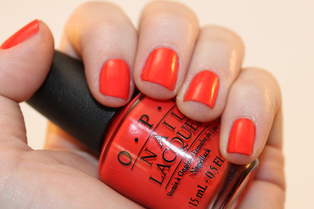
This shade is bright - almost blinding red-orange. You cannot miss My Paprika is Hotter Than Yours from a mile away. We loved how this looked and will definitely be adding this to our rotation! Two coats to opacity, no topcoat.


This shade turned out to be more of a jelly than the others when we applied thin enough layers - perhaps a jelly sandwich in our future? Suzi's Hungary Again is a cheery pink, we applied three layers with no topcoat for this swatch.


If we're one thing (other than nail polish addicts) it would be glitter addicts. This glitter is fab! Pink, turquoise and blue-purple small hex glitters mixed with fine glitters in the same colours make a great topper for any mani. We used two coats of Polka.com over Eurso Euro for this swatch.


Overall, we love how fun and bright this collection was. The collection includes a total of 12 polishes, which in addition to the ones above boast copper, rose, and gold metallic shades, as well as a milky creme (My Vampire is Buff) which we're currently on the hunt for. The collection also includes another, darker blue shade in I saw… U saw… We saw... Warsaw as well as a deep purple shade in Vant To Bite My Neck? We definitely recommend checking out the rich hues in this collection - and stay on the lookout for our nail art using some polishes from this collection in the coming days!

You can check out OPI online, or on Facebook, Twitter and Instagram!

Disclaimer: These products were provided to us by the company/PR for our honest consideration and review.